Home
Rockin Fossil
Jul 1, 2022
The world's finest fossils for the masses
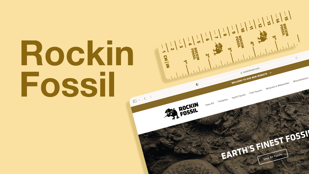
Rockin Fossil sells fossils and minerals to people all over the world. As a small business run by a couple in Arizona, they needed a low-cost and effective way to sell items (fossils/minerals) that were unique at scale. I built a robust Shopify storefront in addition to a new brand identity that embodied the company's vibe in the digital age.
The live site can be found here: rockinfossil.com
Overview
Rockin Fossil is a small business run by a couple in Arizona. Over 90% of Rockin Fossil’s sales are conducted on eBay, but almost all of their high-end items are exclusively sold through their website. The company’s old website was built on Squarespace and had very little flexibility in terms of product categorization, mobile media uploads, and properly displaying items for sale.
Since each and every fossil is unique, Rockin Fossil needed a solution that streamlined taking 5-10 photos, highly modifiable product description templates, and robust product categorization options.
🦖 Brand Updates
💡 The business owner requested minimal changes to the logo. It will be used on the website, on socials, on business cards, on digital and physical receipts, and potentially merchandise.
Logo
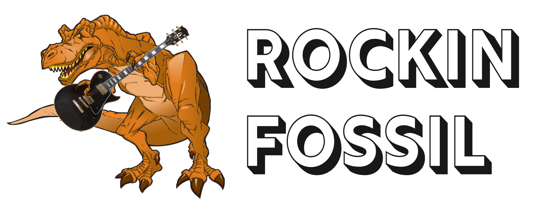
The old logo was far too detailed, contained mixed styles of photography and illustration, and employed a generic two-tone font. When on a black background, the text’s shadow effect would disappear, and on complex backgrounds, the dinosaur melts into imagery surrounding it.

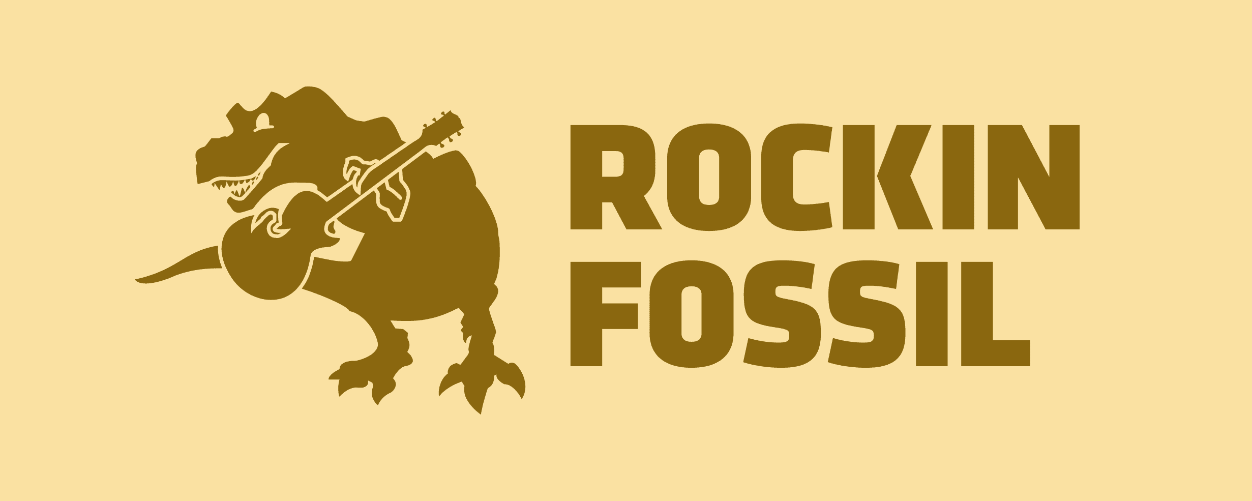
The new logo attempts to simplify both the dinosaur and the wordmark without stripping the brand of its core identity. The monochrome design allows for the logo to stand out on any background independent of color or complexity. Klavika was used for the wordmark as it provides a sense of strength and wildness without going overboard.
Logo Variations



Physical Implementations of Logo
📏 As the products all have varying sizes and shapes, it is imperative to include a form of scale in product photography. That’s why a custom branded ruler just made sense
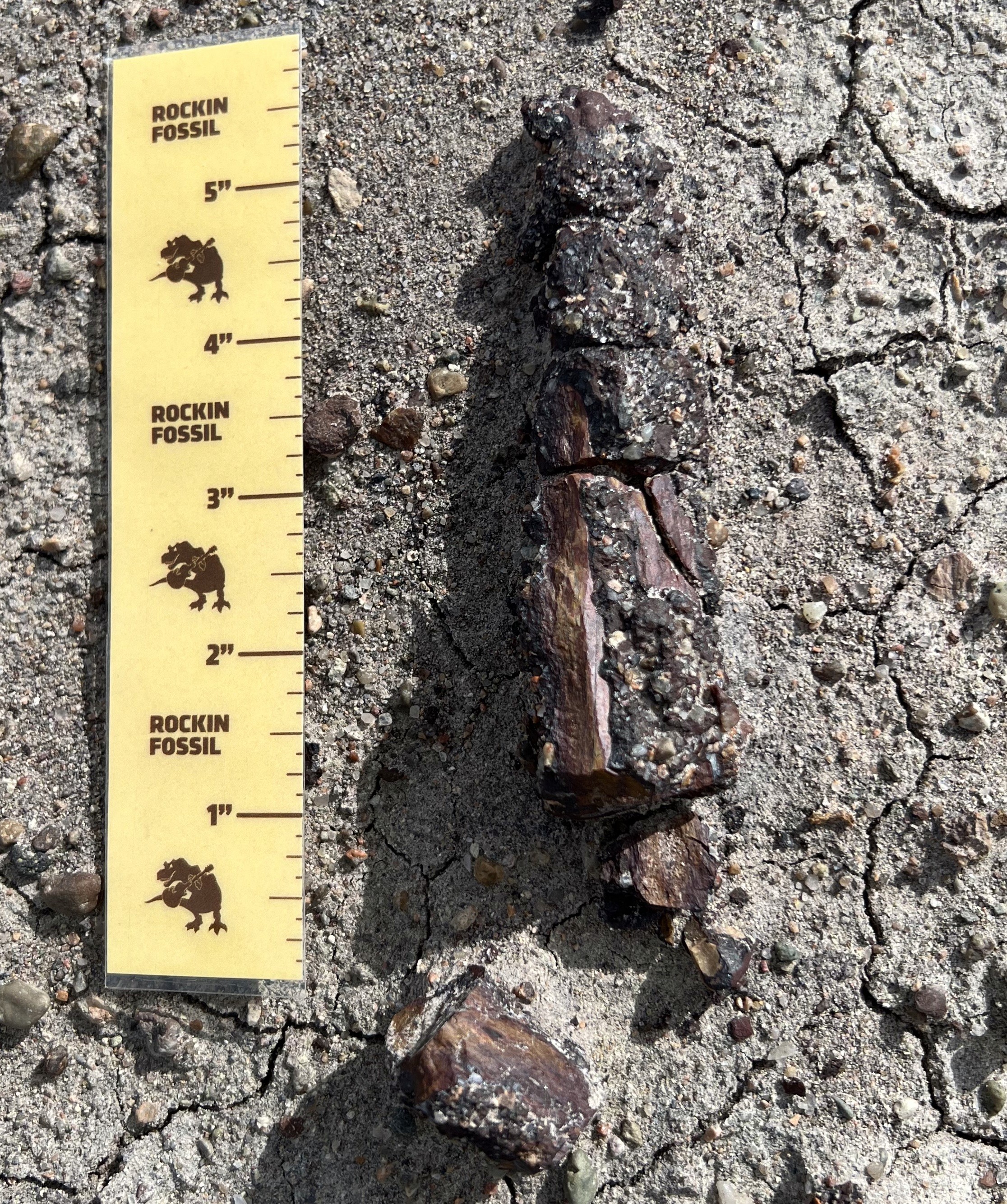
Client used an early version of a Rockin Fossil ruler to measure the length of a fossil long bone in her field collecting operation.
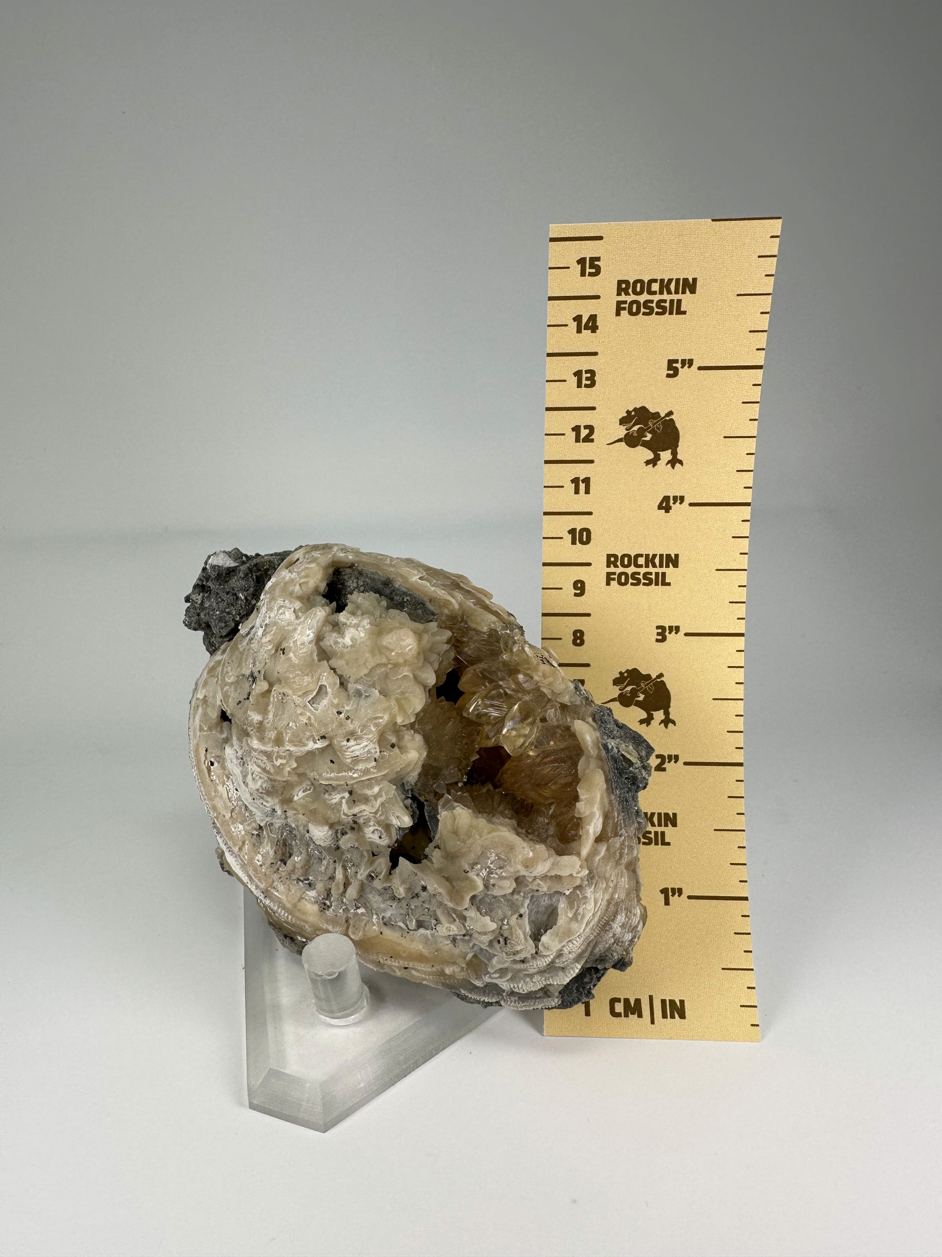
Ruler shown here as a scale next to a fossil clam from Florida.
👨💻 Customer-Facing UI/UX Changes

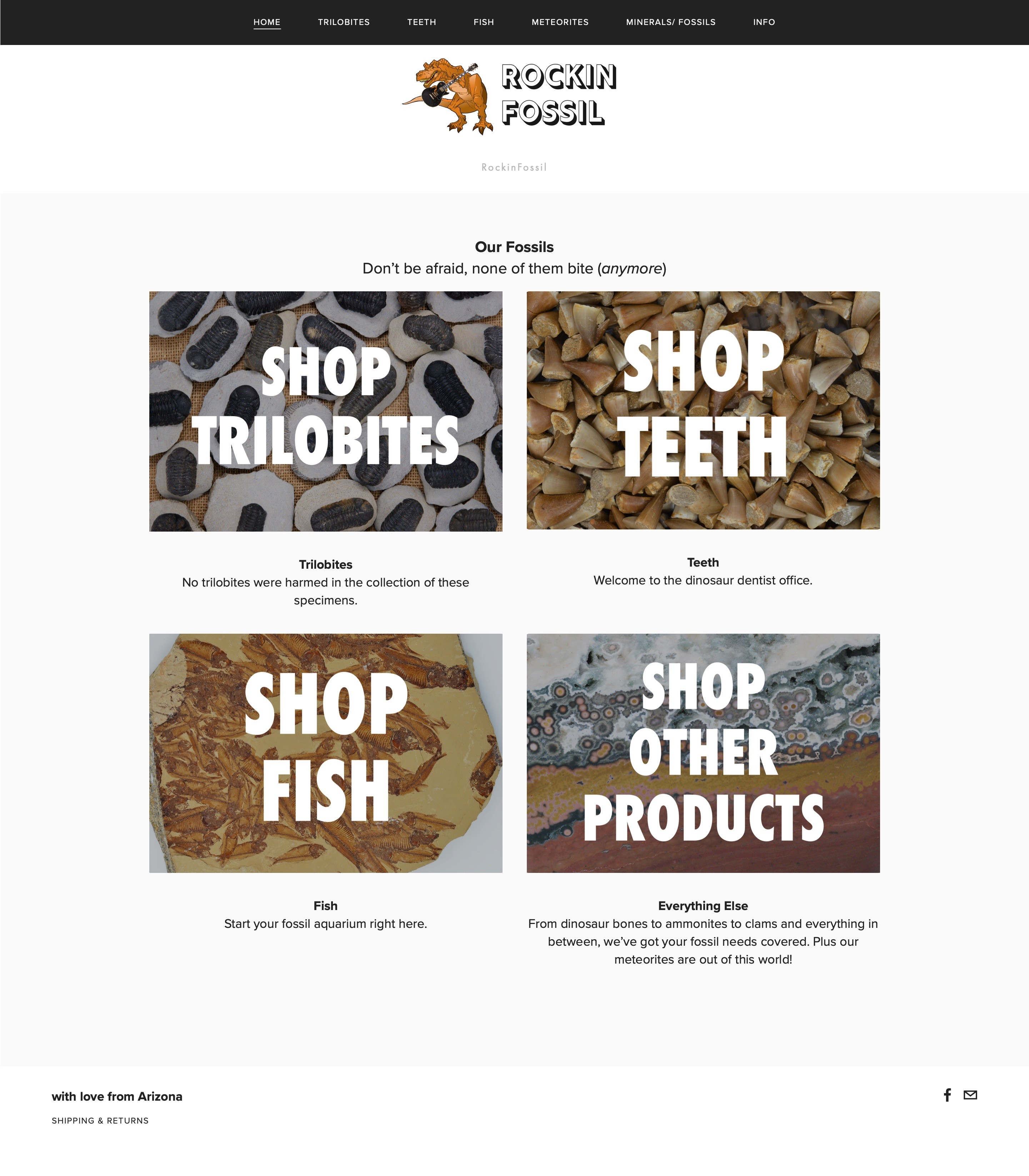
BEFORE: Four cover images composed the entire home screen with a remarkably poor use of space. Navigating to a product page takes at least two clicks from the home screen.

AFTER: Product collections are presented with simple representative images followed by a dozen product pages that are just one click away on backgrounds with a splash of color.
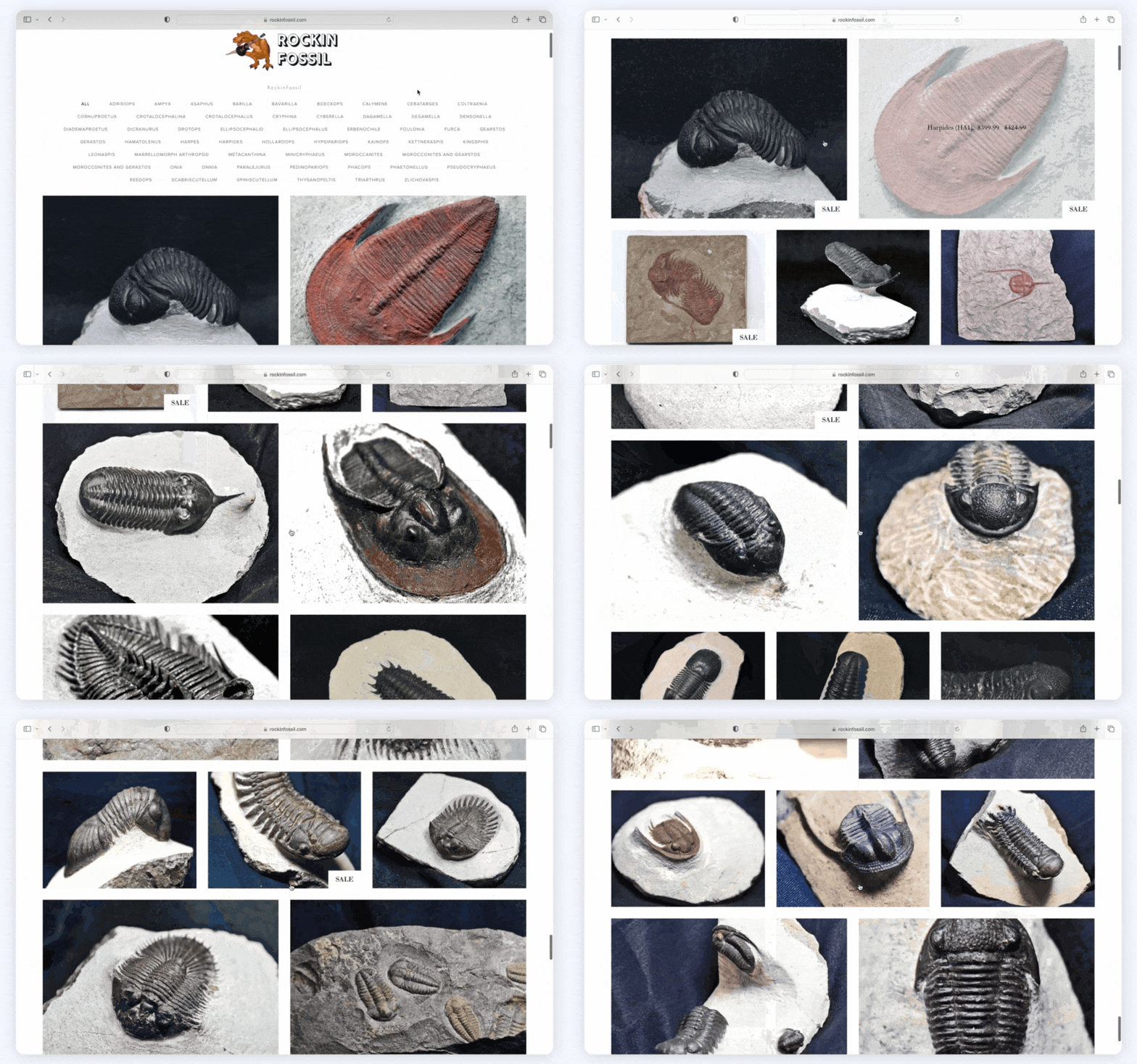
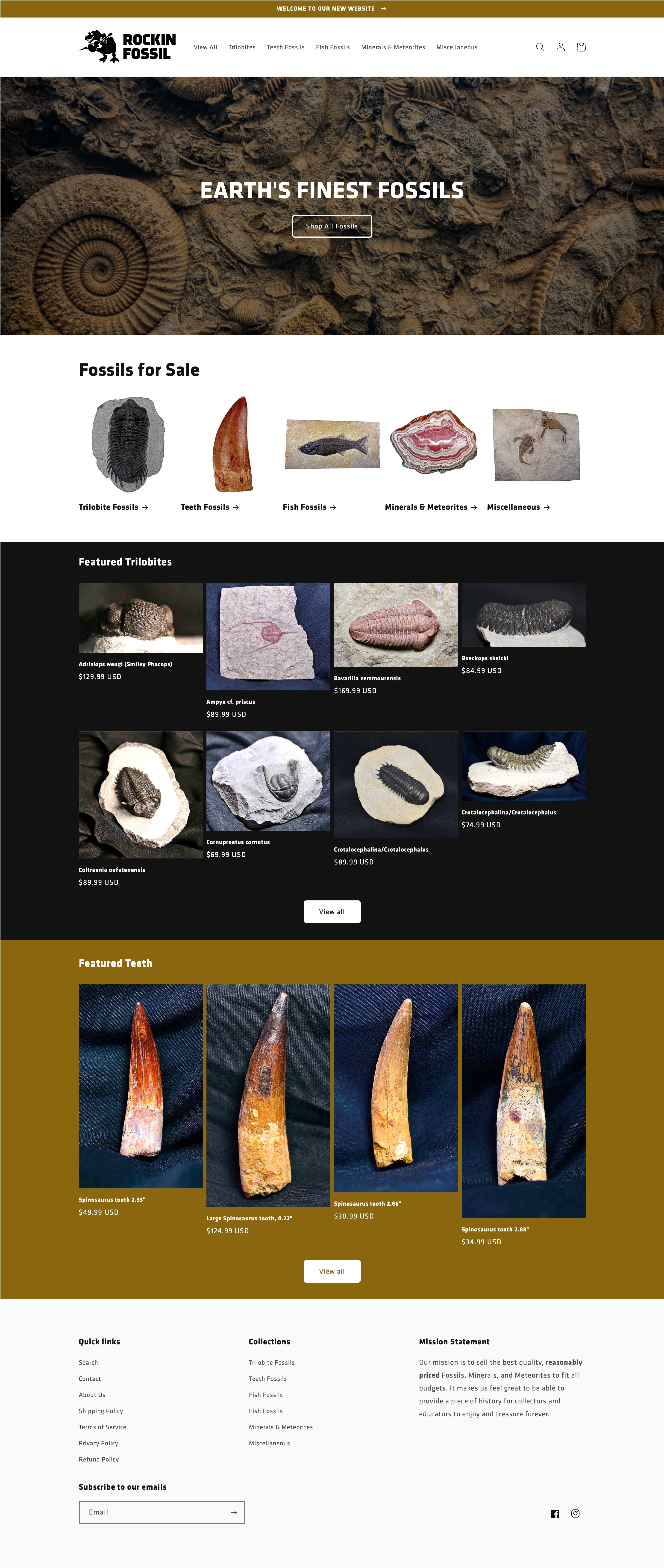
BEFORE: Product collection pages did not have titles or prices visible until hover. Image sizing was artistically non-uniform but images were still cropped leading to strange sizing.

AFTER: Product collections now limit total products shown as to not overwhelm customer. Images are not cropped as to preserve their original design without disrupting page formatting thanks to a min. row height set to the height of tallest photo in row (plus text).
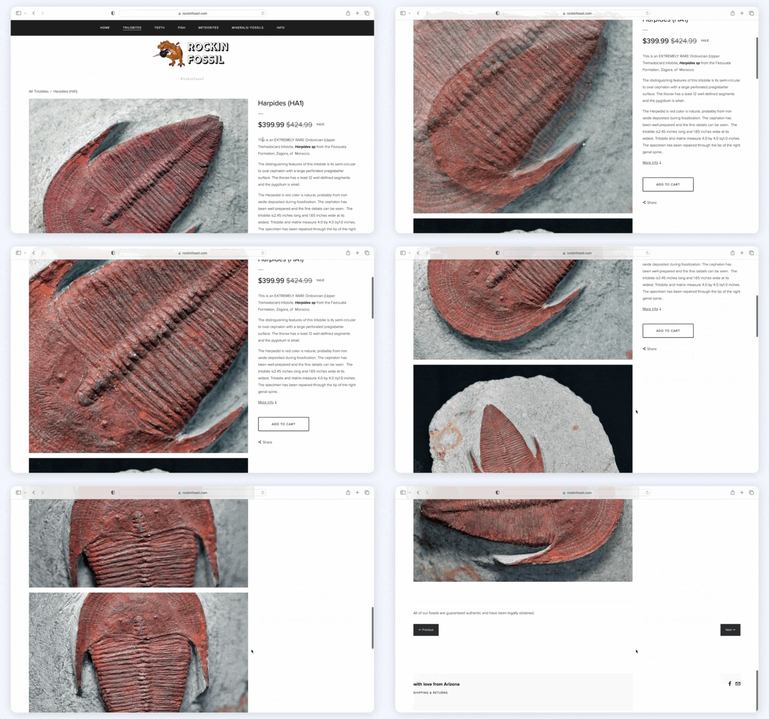
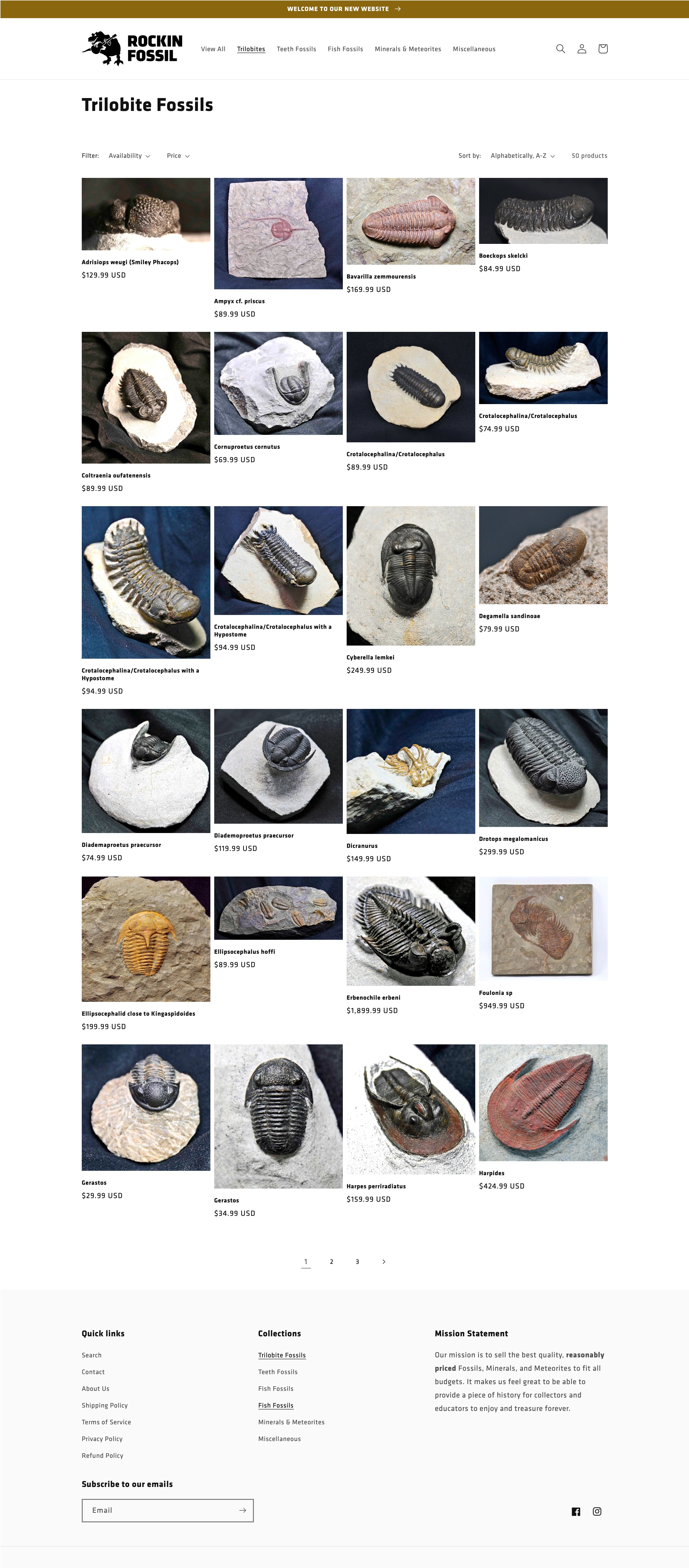
BEFORE: Upon scrolling to see other photos, the title, description, and add to cart button disappeared. The hover-to-zoom feature felt off-putting while scrolling.

AFTER: All the text and buttons remain visible while scrolling through product photos which are followed by a “You may also like” section with comparable products for sale.
Full design breakdowns:
Home Page
BEFORE
AFTER
Collections
BEFORE

AFTER
Products
BEFORE
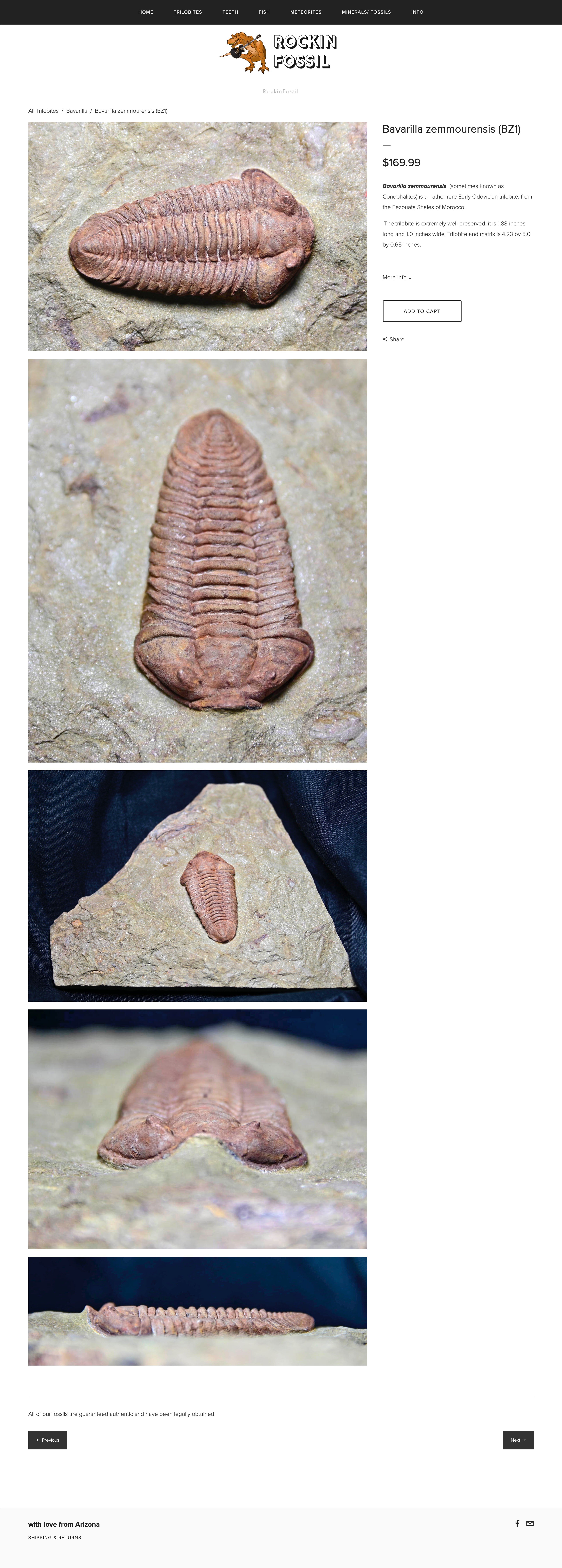
AFTER

🛍️ Client-Facing UX Changes
Product Collection Organization

All products are automatically sorted into their respective Collections based on the SEO tags. The product logic is set up in such a way that the client could achieve extreme degrees of granularity with ease. This could range from broad sweeping filters like the region the product is sourced from all the way down to a specific subspecies of the specimen.
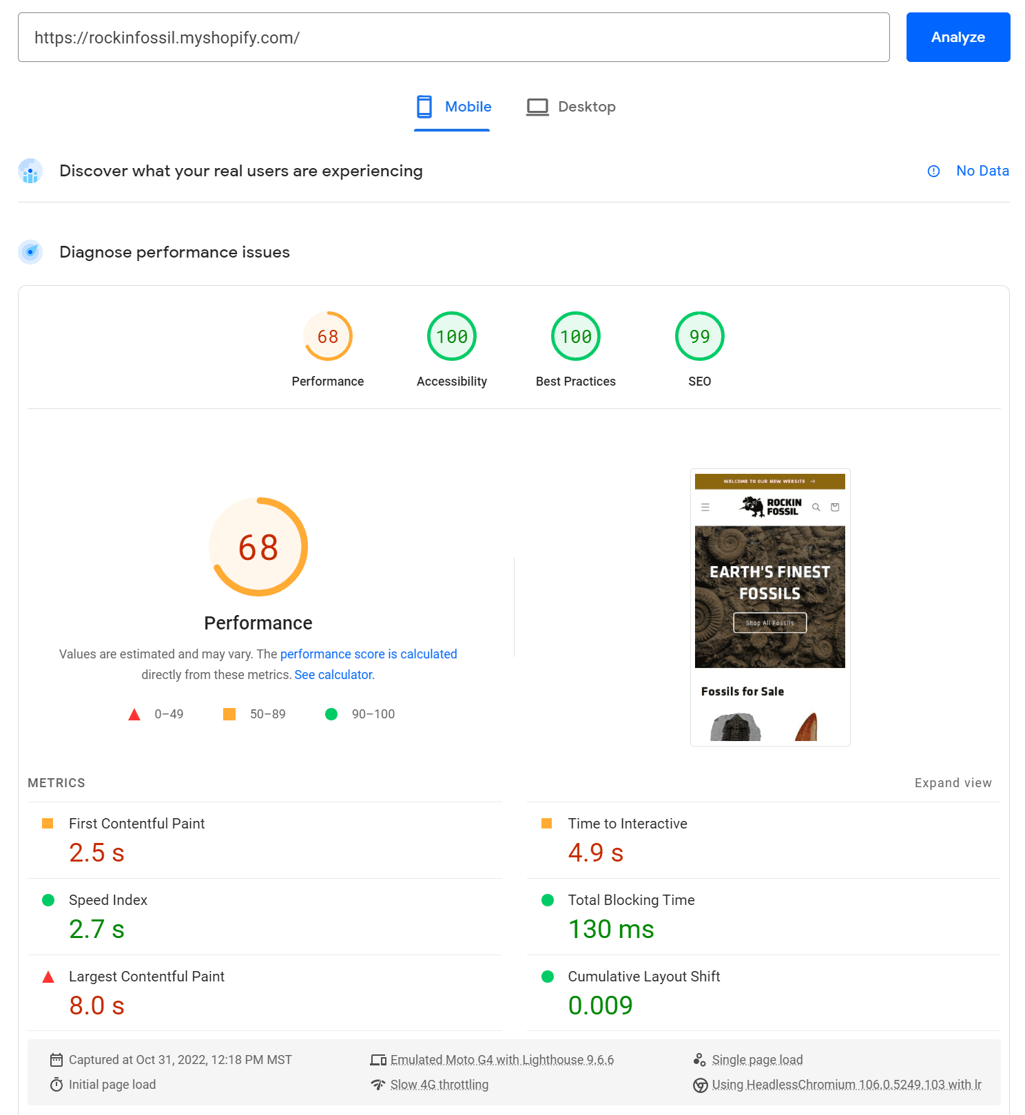
⚡ Page Speeds
Home Page
Before
Desktop
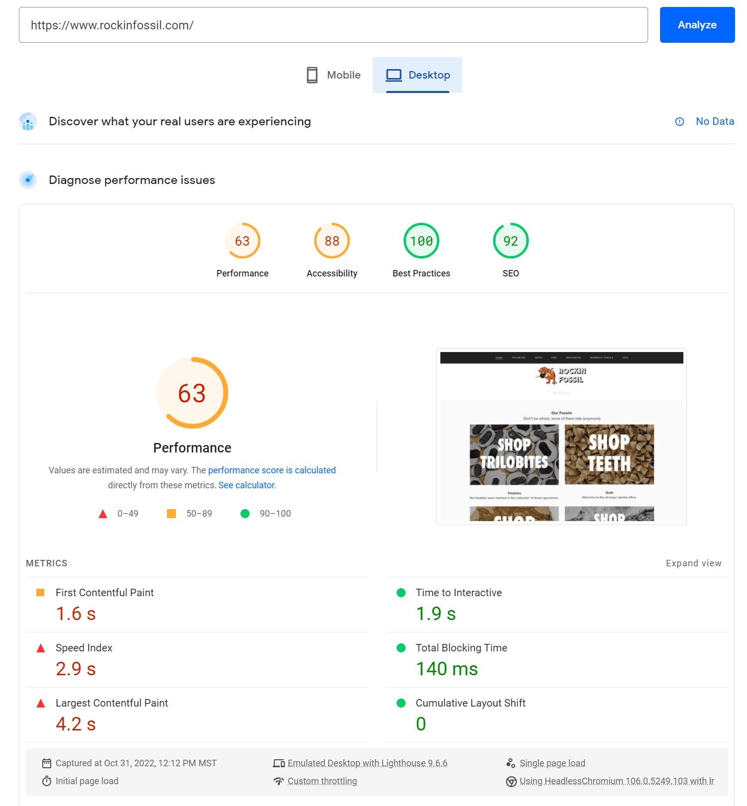
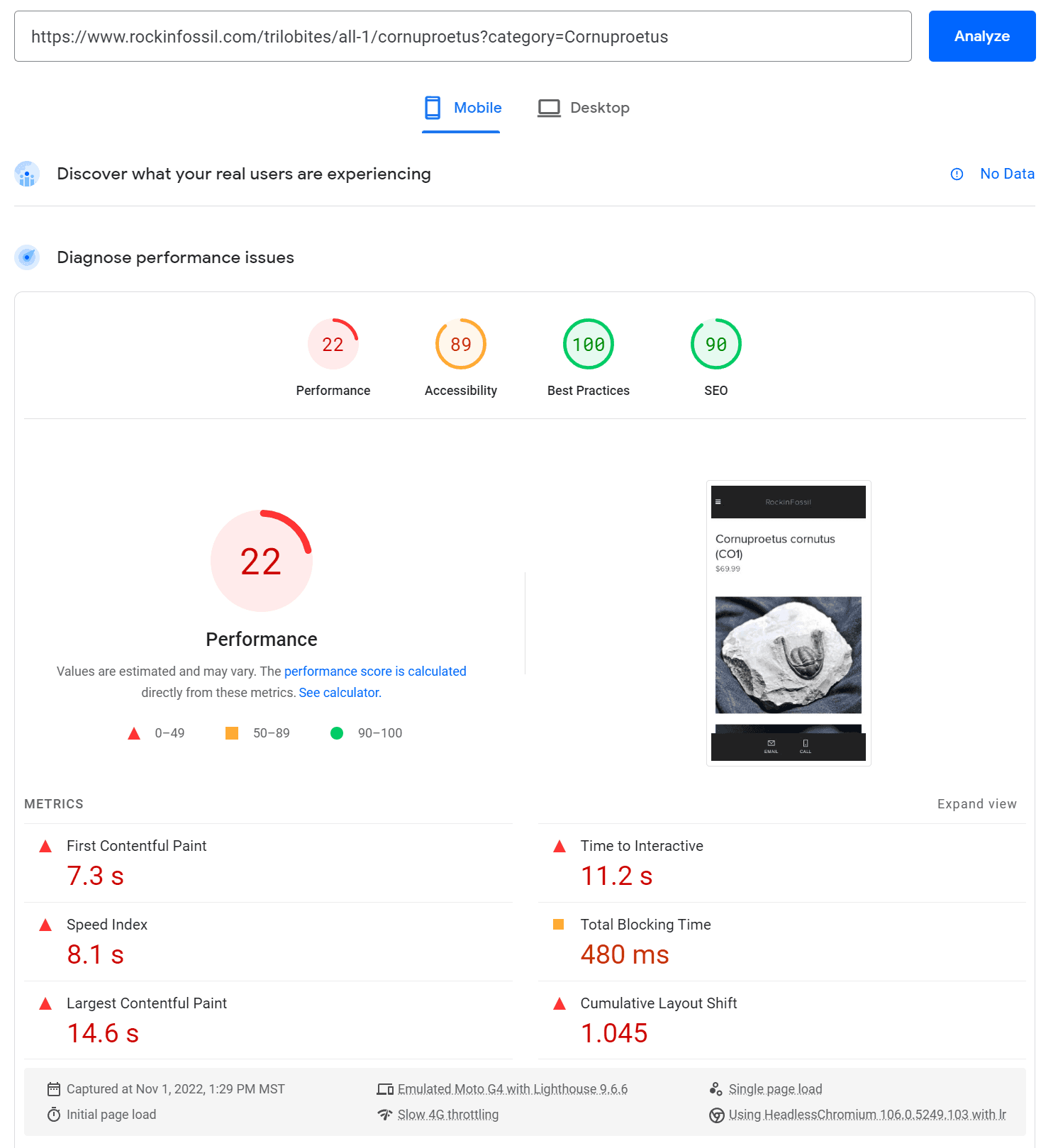
Mobile
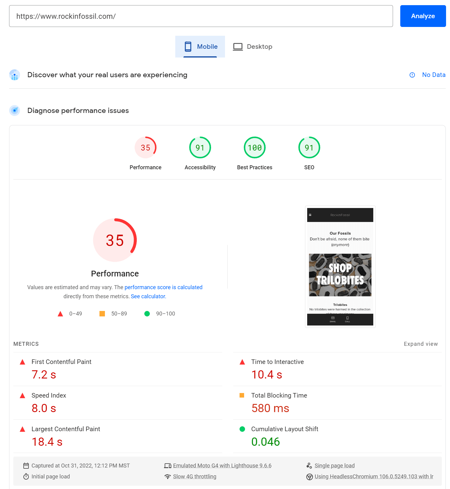
After
Desktop
Mobile
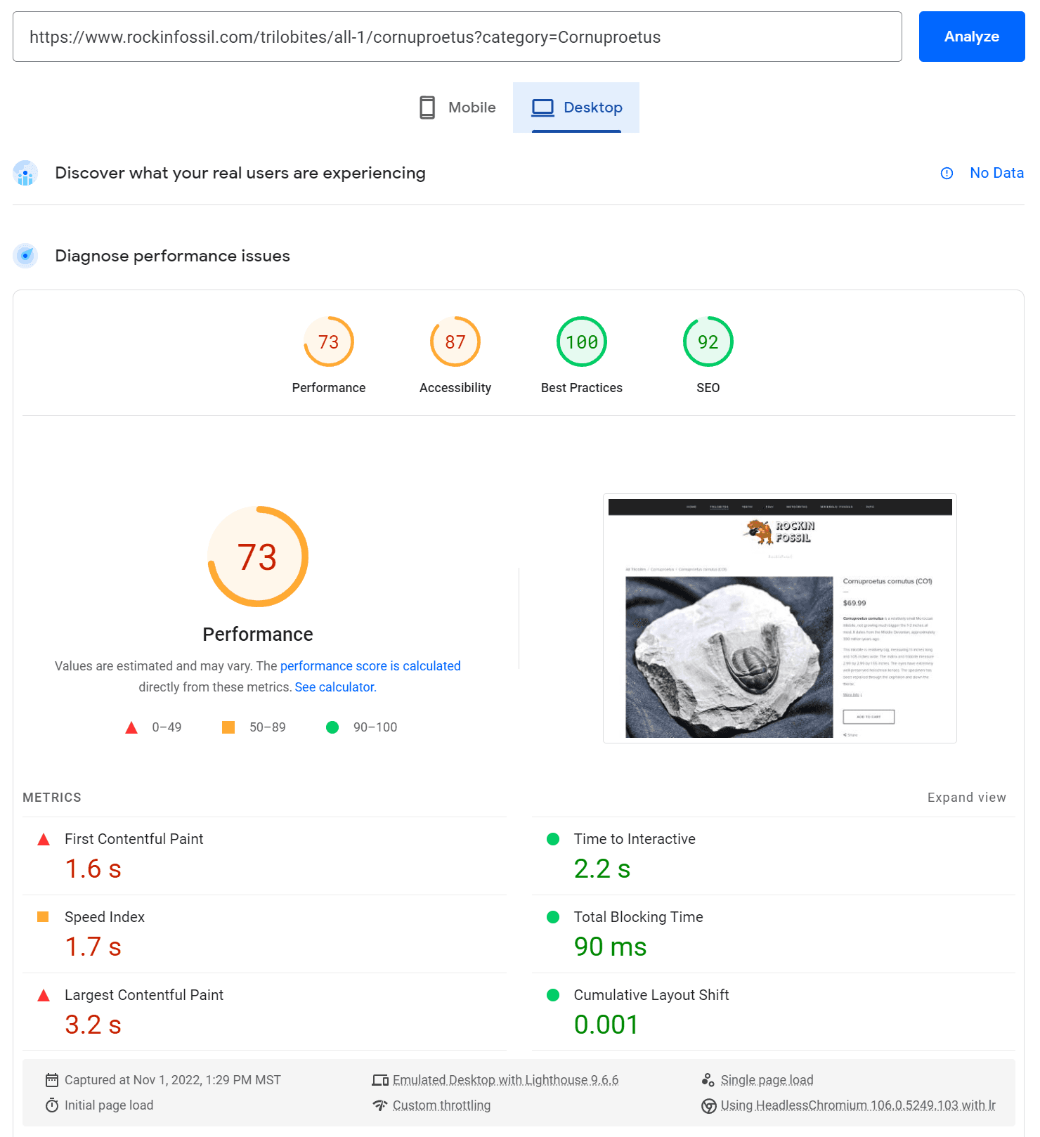
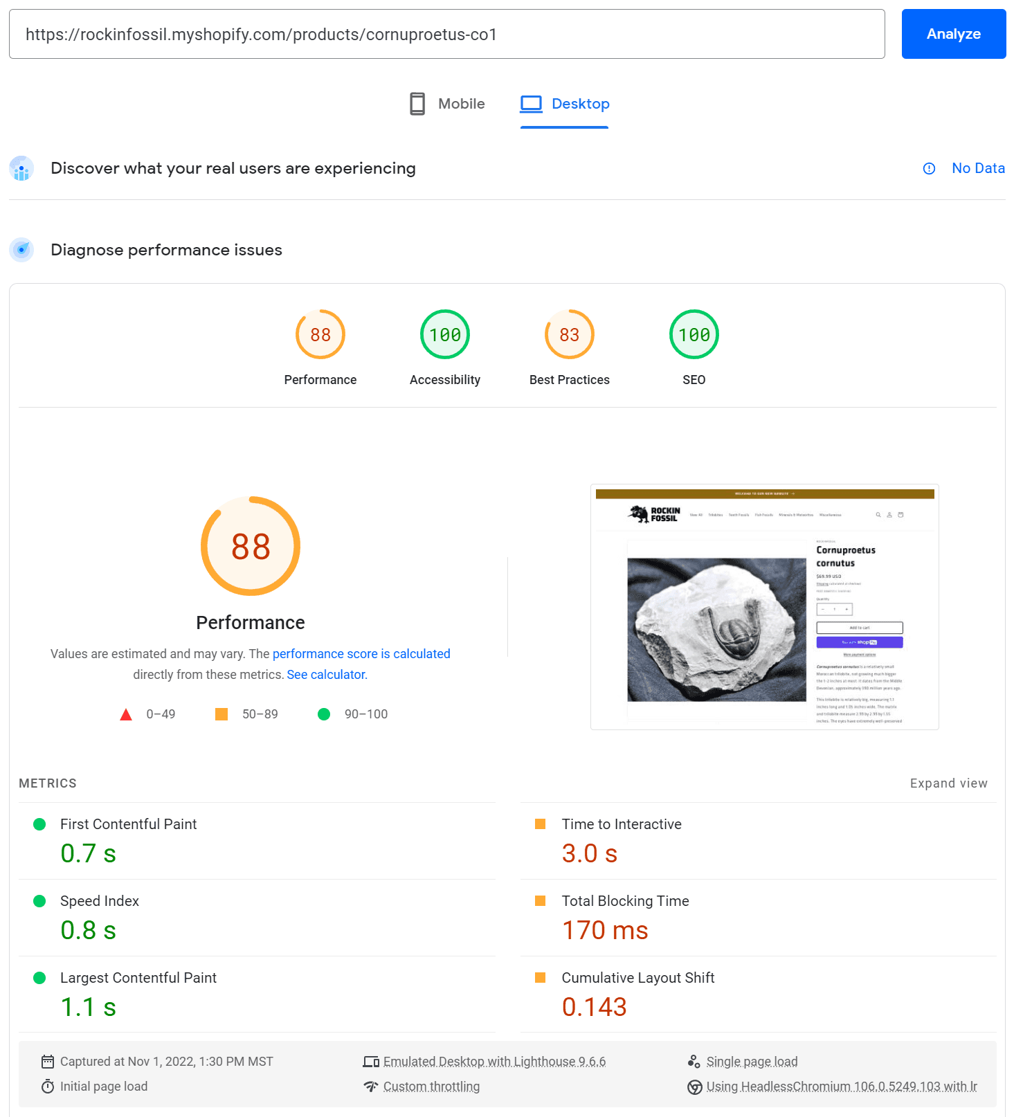
Product Page
💡 There will be slightly more result variability among various products compared to a relatively static page like the Home Page.
Before
Desktop
Mobile
After
Desktop
Mobile
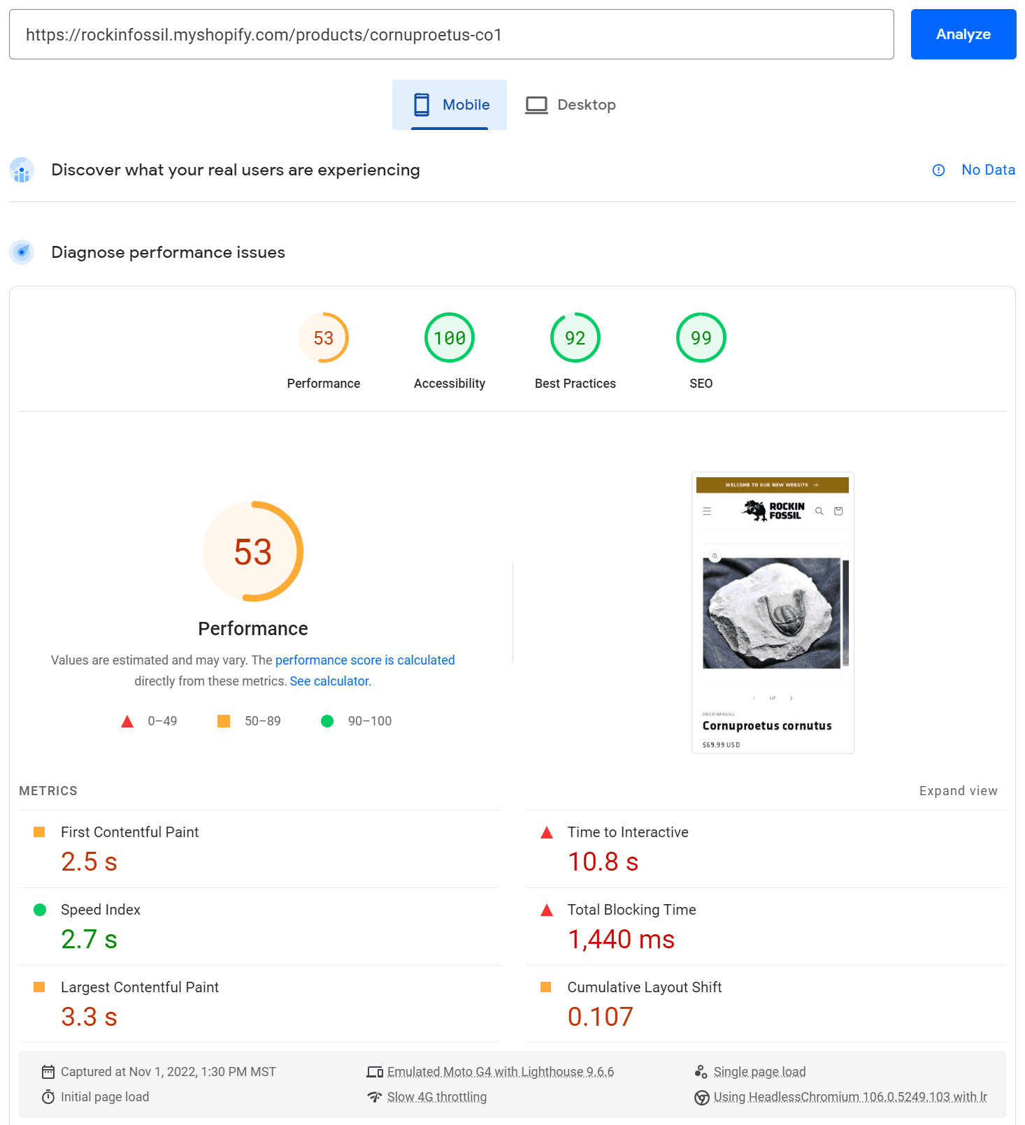
Results Explained
Home Page Desktop Performance jumped considerably with a 44% increase after the migration to the new site. Home Page Mobile Performance just about doubled. Both versions achieved perfect Accessibility and Best Practices scores while having near-perfect SEO.
Product Page performance is harder to unify across all products (varying pictures, descriptions, etc), but generally Desktop Performance increased 10-20% and mobile performance almost always increased 100% or more.
Some considerations included the minimization of custom fonts, loading fonts with browser default preferences (prioritizing swap), optimizing photo sizes and file formats, adding alt text to images, and eliminating unnecessary code.
Takeaways
Home Page Desktop Performance: 📈 44% increase
Home Page Mobile Performance: 📈 ~100% increase
Product Page Desktop Performance: 📈 ~15% increase
Product Page Mobile Performance: 📈 >100% increase
Nice, do you have any other projects like this?
Yeah, take a look!
